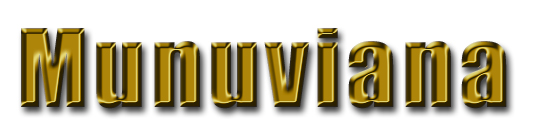
I got tired of looking at this same old basic white MT template... have been for some time... so I thought I'd do something about it...
I got my buddy Pam to do a neat banner image for us using the gold color that was already in the banner text. Then I ran that color through the disgronifier to get some different shades. Then I did a new stylesheet - a really subdued, yet classy looking design. Then I added some thingys and doodads. Then I put it up over at the MadLab.
Go look at it and see if it would be OK to use over here. I've got another gig I've got to work on starting Thursday, so it will be taken down Thursday am Texas time. If mostly everyone likes it and Pixy says OK, I'll drag it over here and put it up for the group.
If not, no big thang... I'll use it somewhere else. As a matter of fact, it looks really tough with a solid black background... maybe I'll use it as a skin or something...
Anyway, go check it out while it's still up.
Posted by Madfish Willie at May 25, 2004 06:13 AMI have nothing to say, other than I love the Bartender and I'd have sex with him in the champagne room....
....and I wanted to be comment 4001.
Congrats, Munuviana!
Posted by Helen at May 25, 2004 11:29 AMIs the fact that it's brown, a hint? LOL I really like it. But, of course, you know I love change.
Posted by Linda at May 25, 2004 01:56 PMLooks good but there's one weirdness to the banner. The lighting on the letters indicates a southeast light source. The shadow is cast as if there was a northwest light source. End result is a visual oddity where the letters will alternately appear depressed and elevated depending on where you look.
Posted by Jim at May 25, 2004 02:24 PMLinda: It's actually supposed to be gold. I pulled the color off the banner image. It looks gold to me on this box anyway. I'll have to check it on my old box and on IE before I move it.
Jim: Turn your computer to where it's facing north. That should take care of any weirdness on your end.
Helen: There is no sex in the Champagne Room! ![]()
Rob, Ted, Emma: Thanks.
Posted by Madfish Willie at May 25, 2004 03:05 PMLooks good, but I'm more of a chrome or silver guy than a gold guy.
Chalk it up to my Amish heritage. Gold is both "English" and "proud."
Posted by ace at May 25, 2004 07:31 PMMy monitor colors are f'd up (blue is a problem) so I can't comment on the color (looks kinda bronze to me). Other than that -- I love it!!!
![]()
Jim hit on what was driving my eyes nuts. The drop shadow on the banner is on the wrong side. As a photographer, that kind of thing drives me bananas. Don't even get me started on the new Blogger templates that have drop shadows on both sides of the same object.
Posted by Light & Dark at May 26, 2004 05:55 AMThe coloring of the titles looks brown to me...but, I AM colorblind (rare for a woman, I know). So....
Posted by Linda at May 26, 2004 01:51 PMIt looks brown to me on my old box with the old monitor. I'll check some more color codes and see if I can get it closer to gold before I move it.
Posted by Madfish Willie at May 26, 2004 11:00 PM